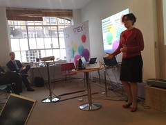
MEX, Customer Research Methodology Must Be Enhanced To Close The Reality Gap: Rachel Hinman, Adaptive Path
May 19, 2009 | CommentsMEX, Failures of Imagination: The Role of Research in Mobile User Experience: Rachel Hinman, Adaptive Path
References an analogy between economic crisis, blamed on a failure of imagination amongst economists and policy-makers. User research isn't naturally associated with imagination either, it's seen as being about hard data.
But user research is often used to validate existing ideas: "tell me I'm right". Hypothesis vs agenda - a hypothesis opens up possibilities, an agenda leads to an attempt for proof.
 Mobile devices are "frankenstein technology", difficult for people to use. But mobile represents "an opportunity to invent new ways for users to interact with information". Mobile devices are a tangible way to explore these new ways, as opposed to intangible ubicomp stuff. But we need to acknowledge our agendas when coming to this stuff - and be more explorative.
Rachel's presenting three examples:
Expert Interviews, for a handset vendor looking at future of UI 3-5 years out. They didn't want to talk to mobile industry experts, but people at the periphery of mobile - those connected to it but with some other specialism. e.g. Bruce Sterling, Adam Greenfield (talking about mobile devices as wands, helping us choreograph our interactions with the world). The wand metaphor comes up again and again.
Took everyday objects (e.g. magnifying glass) out into the street and pretended they were mobile devices. Pipe-like devices lead to metaphors about pouring data (reminds me of the Siftables presentation).
Deprivation Study from 2007 - about accessing internet content on a mobile. Shows video of users talking about accessing content mobile-ly; they note that mobile is different and might need different, tailored UI. Quoth one: "It's called surfing for a reason - it's about a flow".
Design principles arising from this research: craft mobile interfaces that speak their power (i.e. use affordances to build intuition); dismantle the page metaphor (which is brittle: if web pages are boulders, mobile elements are pebbles); and cope with partial attention.
Decrypting Context; it's hard to grok because it's complex. How do you design for anything and anywhere? "It's about understanding human relationships to people, places and things in the world". Relationships are semantic (based around shared meaning), social, spatial or temporal. These relationships rarely occur in isolation.
Example: peanut butter has a spatial relationship (it's in a cupboard at home, or in a certain place in the store); a temporal one (probably have it on toast in the morning); a social one (she's on the Flickr stream for it and has heated arguments with friends about it); and a semantic one (when visiting Japan she'd need to know the word for it and would have to pantomime it).
How can a mobile help Rachel get peanut butter in Denver, NOW?
Mobile is better than a PC for spatial or temporal relationships because you can physically move it to relate to the world... and because it's available to a greater degree.
See also Adaptive Path on Mobile Literacy and Rachel's slides on SlideShare.
Q: There's a lot of research on how usage patterns differ by age. Aren't children closer to the future than we are?
A: I think Africa is probably nearer. If someone's carrying a baby and their phone, this shifts social structures. It's not about technology and device, but how it's shaping how people do stuff.
Q: Intrigued by wand analogy. Harry Potter had some usability issues!
A: Adam and Bruce both said they liked the idea it evoked, but the challenge was that there's a mystery element to it, a sense of uncontrolled sorcery, which may not be something you want to put out for users. A conductors wand is probably a better metaphor.
MEX: Breakout groups on materials
May 19, 2009 | CommentsMEX: Breakout group on materials
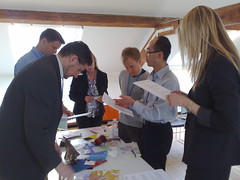 We broke out into groups. Ours was looking at materials: identifying a couple (from a large collection) that could be used to create a future mobile product.
We looked at Bamboo fibres, thermosensitive
Steph's group: lists buttons that couldn't go into touch-screen without impairing UI. Usefulness of volume control as a physical affordance doesn't mean you shouldn't have touchscreen version - combine and have both.
Disadvantages: can be confusing, relying on software can mean you have to use two fingers.
Big advantage of hardware is the reassurance of having done something physical.
Next group, 2dogleg, asked: can you develop a standard palette of haptics for all handsets?
"We skirted the issue a little bit" :) Ended up with use-cases where haptics would feel welcome: silent alerts, tracking location within the keyboard (for sightless text entry), button confirmations, linking to animations (so that you get a feeling from the phone when moving screen-to-screen), showing affordances.
Next group, 2corner, discussed new physical materials to be used in mobile devices: why aren't we using new ones?
 Jo Rabin takes the floor. Talking about wand properties - phone responds in colour, shape and texture to altitude, pollen or swine flu. Samsung has antibacterial keyboard coatings. Squidgy phone might be useful as a grip, to fit the exact dimensions of your hand (like buying a ski boot, tennis racket, etc). Phone might act as a stress-ball, with memory to resume its previous shape. Might stretch to show bigger keys.
Dynamic buttons that pop up in response to finger-over, using electro-deformable polymers. Phones should age better - become more comfortable over time, like a nice pair of shoes deforming nicely with age. Durable exterior, replaceable interior.
Ken Blakeslee with the next group, choosing two new materials from a box-ful, "spending a long time squeezing and stroking". Got more down to emotional touchy-feelyness. Left smell and taste out of the 5 senses. Make phones waterproof - immersion is an issue that affects lots of devices. Materials that react or reflect you and your feelings. UI to capture emotions and convey to other remote folks.
Finally, our group - again, choosing two materials. Most of our group were software people, unqualified for hardware. Got very excited playing with the materials. Different contexts of use may benefit from different materials (not sure I agreed with this - IMHO contexts like work/home are collapsing into a consistently maintained identity). Wood is a luxury item; many phones are luxury items. Wood degrades. We also had bamboo fibre (looks like a wig) - it appears questionable but could be weaved or embedded into a matrix, and therefore deployed like carbon fibre.
Marek: renewable materials are a huge issue. User expectations around mobile devices are keyed off the question "is this sustainable"?
Another group looked at another dimension: proximity gestures. What does proximity mean? What is contextual awareness? Gestural input? Haptic feedback? So your device alerts you ambiently to changes in your environment through haptic feedback... but how can you calibrate this without looking at the device directly? How do you know when the device is listening to you? How can you ask it to pay attention - tapping it perhaps?
Back to next group, asked to come up with a user-centred haptic palette. Started thinking about geographic separation and a teenage audience. Wanted to capture 5 emotions and think about how to capture them: love, hug, kiss, affect, "help - existential crisis!", "I'm checking in" (like a Facebook poke).
One teenager is on a backpacking trip, one at home. "Hug" feeling might be a pulsing, or warmth generated from the device (very CuteCircuit). "Help" might be a shocking feel.
Penultimate group, looking at what happens when you focus on touch input. What happens when the touchscreen can sense the amount of pressure being applied? Capacitative touch screens like the iPhone are great for multi-touch, resistive touch (more associated with stylus input) can detect how hard a user is pressing. Hybrids exist too.
More pressure could mean faster, louder, more emotion.
Final group, talking about electro-deforming polymers. Three opportunities: bringing back touchable physical controls, expressing emotion and accessories.
Touchable physical controls: there's an advantage to being able to present specific buttons. Lots of the mechanical control elements like turn knobs afford the same kind of tactile feedback as we apply: it's a simple action/reaction. We lose this with touch devices but can simulate it back in with positional switches, knobs, etc.
We thought about device morphing to change or express emotion - think about how much is in a weak or strong handshake, say? Receiving device can feel the reaction of the action. We use EDP to create a cirtual piano keyboard.
Everyone's been enchanted by the "squishy ball" which was going around...
Marek: tactility is emotionally engaging, and if there's anything people will pay for, it's emotional engagement.
MEX: Appstores and their consequences, Hampus Jakobsson, TAT
May 19, 2009 | CommentsMEX: Appstores and their consequences, Hampus Jakobsson, TAT
TAT: licenses UI software, does inspirational design. Kit ships on 10% of all devices 2008. 140 people, Sweden, US, Korea.
Apple and Palm are arriving and doing impressive things - this is frustrating for incumbents, but empowering.
How could it be improved?
- Context: location, time could be used to funnel users towards appropriate applications.
- Discovery is like Digg - the top apps get loads of traffic, it's hard for others to break in.
- No try before you buy.
- No tell-a-friend.
- No recommendations or discussions.
- Less uber-control by one player would help. How about co-branded stores (the MEX store)? There's no transparency.
- Categories should be premium ($4.99+), standard ($0-4.99) and free.
- Get What's Hot from derivatives.
- Measure and rate by value = price times volume
- Sort on ratings not volume
- Add 25% with few ratings to improve discovery of new apps.
- Why not friend-to-friend sales?
App stores will be just the start of advanced personalisation. When Apple released their phone there was no app store - the first ones were hacked-in.
History of personalisation: started out with contacts and SMS, then pictures/videos/music, now apps and bookmarks. Phones have infinite uses once you add applications.
We have to make the UI more dynamic (cough, says vendor of dynamic UI solutions). Apparently UI should be experience based and match the real world, anticipate your needs, etc.
Mobile phones "steal us from one another" in their attention-grabbing.
A lot of Apples innovation was around the payment experience, and is amazing.
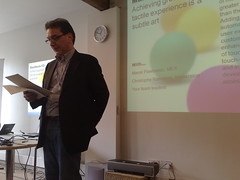
MEX: Achieving great tactile experience is a subtle art, Christophe Ramstein, CTO Immersion
May 19, 2009 | CommentsMEX: Achieving great tactile experience is a subtle art, Christophe Ramstein, CTO Immersion
Gets us to take one anothers' pulse.
As person taking the pulse, you were able to perceive something invisible and engage on another level. Haptics is an invisible experience we're trying to bring to the computer.
 What is it?
Cutaneous sensors - skin is 2 square metres! Kinesethesia (positioning of body parts). Proprioception (integration of sensing with self-awareness?).
You can't feel if you don't touch - it requires proximity and contact. Haptics is intimately related to motor control. Touch reinforces sight and sound and needs to be consistent with them. "Touching is believing".
Hardware vs digital?
We have new types of UI enabled by haptics, and enhanced UX. And it might be realistic (simulation-based) or interactive.
How does it enhance UX?
Pros: direct/natural manipulation, maximise ergonomics by combining output and input, reconfigurable UI.
Cons: typing, visual occlusion, lag, sensing thresholds. Mechanical keyboards are still better.
Samsung and LG have quickly replaced their UI with touchscreens, and are now moving to haptics.
How can we leverage it?
Touchscreen navigation/typing is a big problem. Tangible messaging and communication is an opportunity. Things become emotional when we touch them. What if we could hug remotely (ahem - you can - CuteCircuit). Non-verbal communication.
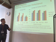
Haptics improves typical WPM and accuracy, "except when you're sitting on a Jackhammer".
You can type on a mechanical keyboard without looking at it. There's a rumour that some car UI will be forced (by regulation) to have haptic feedback to make it safer.
What are the design guidelines?
Design tools for haptics: synchronise with sounds, shape parameters (amplitude, frequency, etc.), design effects and experience in real-time. Today we're talking about "button confirmation".
Q: We know haptics is important, but there are so few tools to experiment with it... how can designers begin to prototype?
A: Look at the ones on our web site.
Q: How do you see gestures combined with haptics?
A: It's about enaction. There's lots of room for gestures, for creating or manipulating content. How do you get the perception that what you did was accepted. (Knocks on table). This is a gesture, the sound, vision and feel gives feedback.
Marek: when you engage with people on an emotion level, you connect with them more deeply. Does this make them more likely to spend?
Decluttering
May 17, 2009 | CommentsFoliage has sprung up across Firefox. I burn it here:
- 10 lessons in bootstrapping from the founders of UrbanSpoon;
- ViaPost looks interesting: redefining the whole of the postal service as "the thing that sits behind a printer driver" tickles and terrifies me equally;
- Control/capability charts on Kanban: interesting, I think, though I'm finding that for me personally the challenge is not in gathering and visualising data, but in working out what to do with it;
- Six questions with Jack Schulze, who I suspect is so Ri it hurts. It feels a bit hypocritical to blog it, but I found myself nodding furiously to his advice that "talking about your work does not directly improve the actual quality of your work";
- Harrowing board games;
- Karl on Kanban, flow and cadence;
- The iPhone home screen can't scale, apparently. Personally I suspect that uptake of applications on this device has something to do with the fact that they're *not* hidden at the bottom of a folder hierarchy - and if users are anything like me, they sometimes disable or delete apps they've once purchased, so the assertion that they need to easily navigate 40+ is balls. Flat home screen is a feature, not bug, IMHO;
- Transitions on Nokia, if nothing else a nice guide to where and how to use these wee beasties;
- 10 things I have learned by Milton Glaser. Number 1 seems to have unpleasant implications for me;
- Why text messages are limited to 160 characters - a bit o'history;