Compulsory iPad First Impressions Post
As required by the Law of Steve, some observations after a few days use:
- The form factor is very pleasing indeed. I've never been a netbook user but I find this device extremely convenient. The optional case is a big part of this, helping me move the little fellow around without worrying too much about scratching the screen, and keeping it at the right angle for typing.
- I no longer see the iPad as purely a content consumption device. In landscape mode the keyboard is perfectly serviceable and I can type about as fast as I can bash out words on a regular keyboard, with slightly less accuracy. I've used it to happily write up talk notes, emails, and this post. I've ordered a Pogo stylus to give sketching and note-taking a go too.
- Battery life is amazing. I'm in the first few days of use, where I'm inclined to overuse a new piece of tech, and I've only given it one charge in the last four days. I know it's not the kind of feature consumer electronics is marketed on, but it should and could be.
- In-app purchases are suddenly everywhere. The Marvel comics app has had me go back and buy about 5-6 times, just by having content I (sort of) want and being so darn simple. I could see my spend on content increasing significantly as a result of owning this device.
- That said, I'm finding most magazine implementations a bit disappointing. Visually they're usually decent, but I find myself lost in them: I have no sense of how far through I am or where I sit in the structure of the magazine, despite having (in some cases) the metaphors and UI explained to me by the magazines creators themselves. Whilst I love the sense of "completion" which Bonnier/BERG have talked about their digital magazines having, I can't get that without knowing where I am and where I've been. Navigation elements showing my position along a slider or even the lovely and subtle Popular Science bar-chart don't seem to satisfy me here... and I'm yearning for the digital equivalent of "flicking through pages" to find an article (titles in a table of contents just aren't descriptive enough).
- When I found out how the Wired magazine was put together, I was a little bit sick in my mouth.
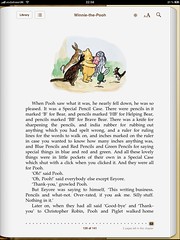
- Lots of physical-world metaphors: the ruled lines in Notes, the leather-bound calendar, the pages in iBook. Complete aside from whether you find them cheesy or not (and I've surprised myself with how bad I think they aren't), Apple, if you're going to do this sort of stuff: follow through. When I'm reading Winnie-the-pooh and I'm on the last page, note that it still looks like I've a whole book left to read. This is both unhelpful (I like to know how much of a book is left) and inconsistent, suggesting a fundamental difference between digital and print which the rest of the UI is trying to mitigate against.
- I don't miss multitasking. There, I said it. I find myself more focused on what I'm doing for the lack of it. Email comes in with a gentle "ping", but I'm not distracted by who it's from. I find this particularly weird because on my (Android) mobile, status-bar notifications are one of my favourite features, and somewhere I've considered Android had the edge over iPhone.
- Google services - which I use a lot - are a mixed bag. Voice search is simply phenomenal, it's snappier and more useful than ever. GMail is good. Docs and calendar both default to mobile versions which I find frustrating, if still useful.
- I've noticed I'm less bothered about having my phone to hand. The iPad is definitely substituting for much of the sofa-surfing, internet-using, recipe-reading activity I was doing on my Nexus before.
So it's still definitely the honeymoon, but I'm getting a lot out of this little device. Tomorrow I'm going to try a day in London laptop-less, for the first time in years..