Glastonbury 2011
 So, it's out there! One of the apps that's been keeping many of us busy over the last few months has shipped: the official app for Glastonbury Festival.
We won the pitch to Orange with a straightforward concept. We know that there are a set of things people would expect from any Glastonbury app, like up-to-date listings and a map of the site - it's important to do a great job on these. Even though line-ups get printed and handed out at site entry, they're frequently revised up to the last minute. A paper guide wouldn't get you to, say, the secret gig Radiohead did in 2010.
And we also know that tickets sell out every year: despite being the biggest festival in the world there's an audience for Glastonbury that experiences it through the BBC coverage, the music press, or late-night texts from friends - instead of actually being there. So we wanted to launch an app that would hold your hand if you were lucky enough to be staggering around on-site, but also give the folks who didn't make it there something too - even if it was just a growing sense of jealousy between 22nd and 26th June. Tying into Facebook is a bit of a cliché in the world of mobile apps, but here it's exactly the right thing to do.
Between the FPers who'd spent previous summers at the festival, there was a strong feeling that we should be realistic, too. The day or so of battery life modern smartphones give their owner is doubly precious when she can't charge overnight; despite the valiant efforts of Orange, connectivity is at a premium on-site; and persuading festival-goers to spend time staring at their mobile screens instead of enjoying the delights of Glastonbury seemed a bit... well, unfair.
Thinking about battery life; minimising use of the network; prioritising clear use cases; connecting people. Sound familiar? In many ways Glastonbury is just an extreme testbed for the constraints of mobile which we've been working with since day one.
If you want to see what we've done, the best thing might be for you to get the app: it's available from the iTunes Store, the Android Marketplace and through the Ovi Store. As you might guess from our name, we believe strongly that if you're delivering a mass-market app, you should often "go broad" and reach as wide an audience as possible: apps aren't just for iPhone owners, and we were chuffed to have Orange agree with us on this. So you can get the Glastonbury app on iPhones, iPod touches, Android smartphones (320x480 and up), and a pile of Nokia devices that support Qt.
If you can't be bothered to go and download the app, the key features are:
- A lush EPG which grabs line-ups (and changes) efficiently, stores them on your phone and lets you pan through them with ease - even if you're not online;
- A personal itinerary for the festival, which you fill with your favourite acts, and with alarms to remind you when they're on;
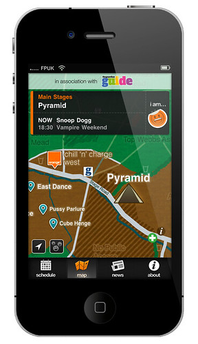
- Full site maps, that show you where you are right now. It's a big old place, and easy to get lost;
- Easy boasting, err sharing, of events through Facebook - so you can tell everyone back home exactly what they're missing. Dancing your wellies off in a muddy corner? THEY NEED TO KNOW!
- A live heat-map to tell you where the action is, right now (even if you're off-site) - we fill this with the mood data gathered when you share on Facebook. This sort of thing is quite novel. We hope it'll be useful, but at worst it'll be an interesting experiment in crowd dynamics;
- A news section, which Orange will be updating before and during the event - worth keeping an eye on (and you can win a pair of tickets there now);
When it came to design, we were visually fortunate: the Orange and Guardian brands seemed like natural bedfellows, so we found ourselves focusing on giving the app the Orange "feel". The icon is a chromatic microcosm of the whole app: that little rainbow gives us the colour-scheme for everything you see after you've tapped it. And the dark colours and background? That's a favour for those of you with OLED screens, which use much less power when displaying black.
The map had a lot of attention: we're using high-contrast stage names and have a subtle stroke around the labels to keep them legible on a small screen, in much the same way as Google Maps does. Some early research into wayfinding also informed the look and feel of the map, inspired by signage. We have lots of respect for the work CityID have done in this area too...
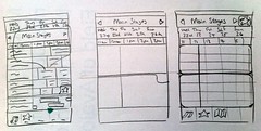
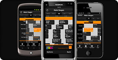
But for us, the centre of the app is the EPG: in early workshops the Clashfinder service was mentioned several times as being popular, and when we looked into it we were sure that the personalised nature of Clashfinder was the reason for this. Who wants to wander around Somerset carrying reams of listings for bands they don't care about? So this, and the interfaces of PVRs, were inspirations for the EPG - and we sketched and prototyped it very early on. This hi-definition prototype we built (in HTML and CSS) was particularly fantastic to explain the workings of the EPG to Orange, and as a reference for our developers:
And of course, the app is available on three platforms - and we felt it was more important for us to take the users' view of things and keep it consistent with the rest of their phone, than keep it identical across devices. So you can see subtle differences between the screens: we use the hardware back button on Android, but have a back button top-left on iOS, say.
The normal way to go cross-platform is by using HTML5 and web technologies; but having done some experiments with these, we weren't convinced that they'd work for us. We wanted high-performance UI, lots of offline storage, lots of deep integration with handset features. Yes, technically you can do these things in a mobile web site, but getting them all working perfectly in a branded app is unexpectedly troublesome. We don't think the web is there yet, for this kind of product.
So Glastonbury 2011 is the first product we've launched publicly to pioneer a new approach - something I've alluded to in the past on this site, and will be talking about at Mobile 2.0 in June. We think it's a good way of combining the best of the web and the best of native - I'll leave it there for now but will be writing more about this later.
 At the back-end, we're using Google Spreadsheets for a lot of the data management. Everyone understands how to work with spreadsheets; we think they provide a nice, simple CMS interface; and we have some technology that we've developed to sit between them and the mobile app and sync down changes, called ProxoCube.
A lot of hard work, including a few late nights, weekends and bank holidays, went into this product. It's the biggest thing we've done in some time, so credit due to the long list of folks behind it - which is everyone at FP.
To the team at FP: Adrian Bigland, Ben Carias, Ali Driver, Sergio Falletti, Matt Gaunt, Thom Hopper, Douglas Hoskins, James Hugman, Trevor May, John Revill, Cori Samuel, Tariq Tamuji, Dom Travers, and Paul Welsh - your names will echo through the hallways of history.
And thanks to Steve, Marianne and Adam at Orange, who've shepherded the product and kept us on the straight and narrow throughout :)